Attuning to Silences and Gaps in Data Analysis and Visualization
Locating and Amplifying Overlooked Data: Tableau and 2,000,000 Tweets
Tableau is a "freemium" data analytic software that, though built primarily for professional data analysts in business and nonprofits, provides many affordances for academic research and visualization in the humanities and social sciences (Bruns et al., 2018; Felt, 2016). After exploring various options that required more programming skills, like the R analysis I discussed earlier, I began to use Tableau because of its easy-to-use Graphic User Interface (GUI) and drag and drop analytical functionality; however, the visualizations like line charts and bar graphs that Tableau offers provide a pseudo-objective perspective, like Donna Haraway's (1988) conquering gaze from nowhere, in which the greatest quantity of items appear to be most significant.
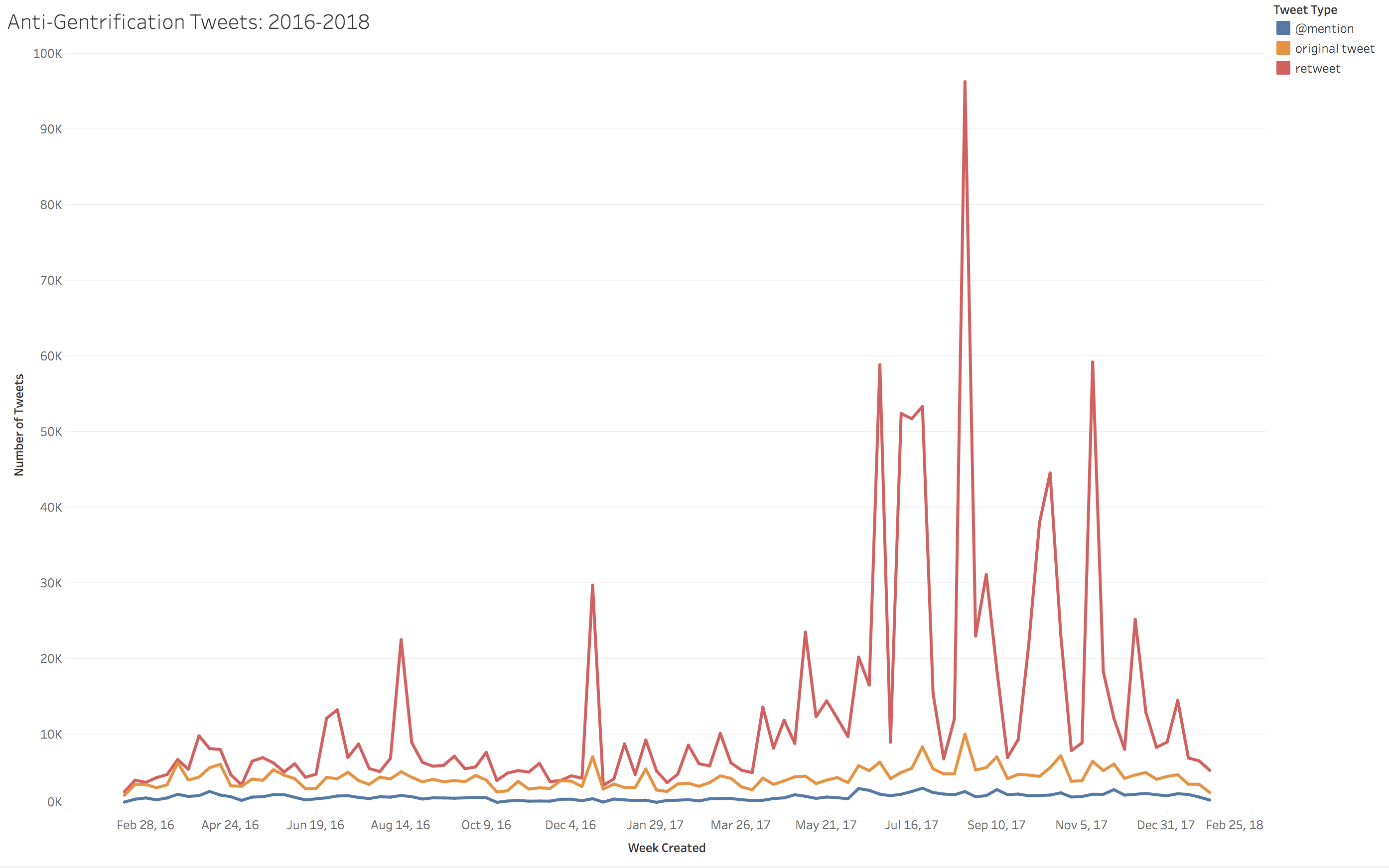
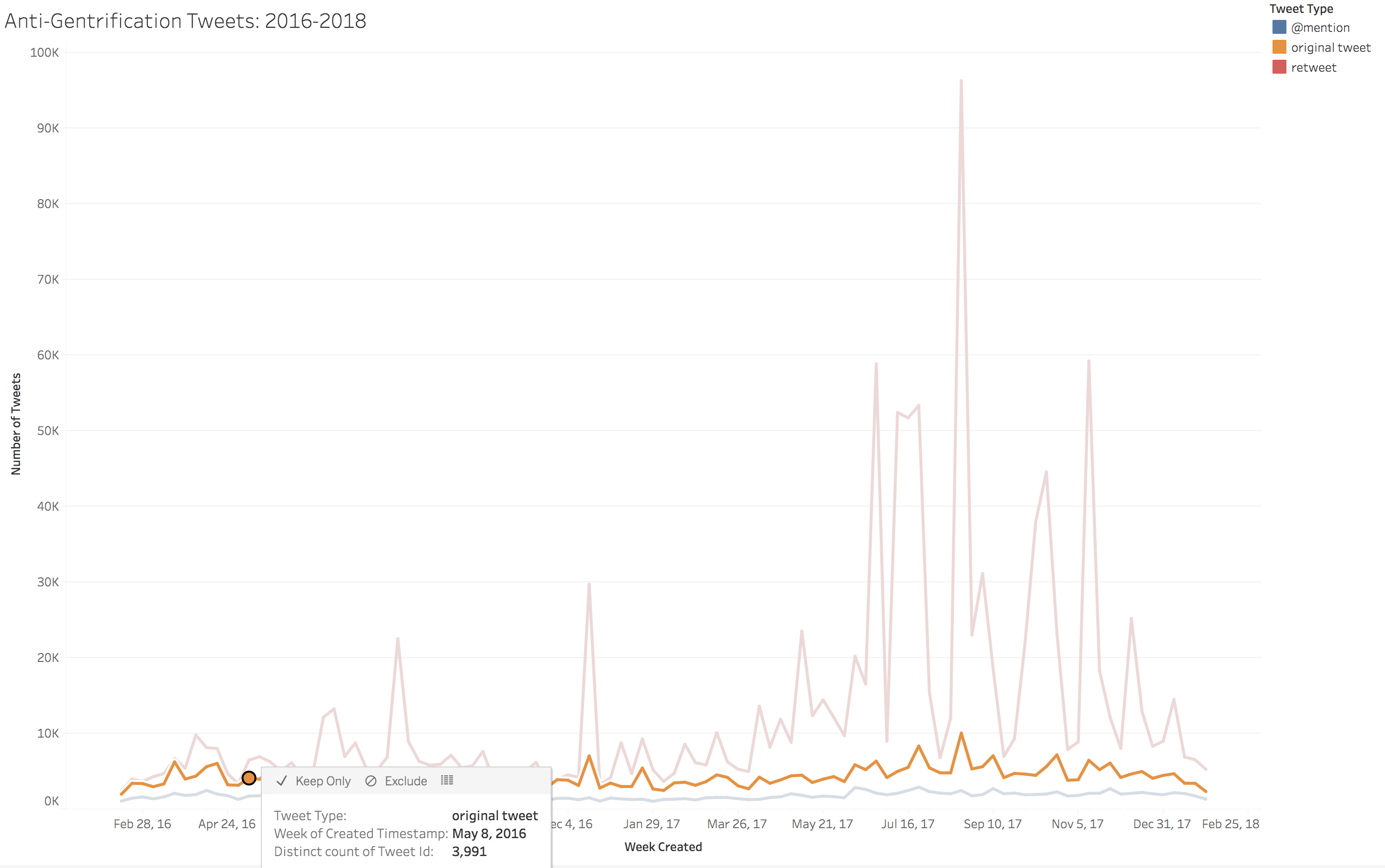
Figure 2 displays peaks in retweets, often viral activity, occurring around the keyword "gentrification" over the 2-year period in which I collected Twitter data. Tableau is interactive in that it allows users to explore the granular data underneath the lines by clicking on a point on the chart, clicking on the view data icon, and then clicking on the full data tab (see video walkthrough on this page for a demonstration of the visualization). A pop-up box will display the underlying data, in this case, the rows of tweets and metadata. Using these features, I am able to sort and export this data for further exploration, arranging the data into smaller data subsets that correspond to various points on the chart, perhaps the peaks in user activity around gentrification, or what I'd classify as particularly energetic and dispersed rhetorical encounters.
By charting frequent retweets and then exporting and human reading the underlying data, I was able to see which tweets in my dataset were most frequently retweeted as well as to match that activity to particular times and in some cases places and events. In short, Tableau helped me to locate and examine gentrification encounters represented in the Twitter data. In the most retweeted tweets, gentrification encounters often occurred in connection with popular culture events and changes in the built environment that oftentimes don't relate directly to housing, but, instead, to a broader observation of cultural colonization taking shape in entertainment, local businesses, and commodities.
For instance, the highest retweet peak occurs on August 25, 2017. Figure 3 displays a screenshot of the original tweet and meme that circulated during this encounter and in the subsequent encounters generated by this instance.
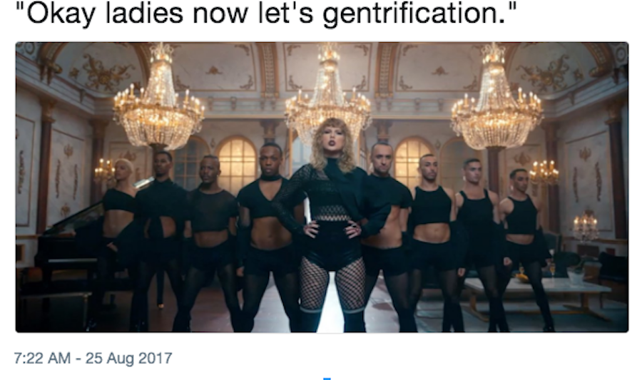
In subsequent retweets, mentions, and remixes, users argue that Taylor Swift is "gentrifying" Beyoncé's song "Formation" in her music video for "Look What You Made Me Do." Some tweets include variations, such as remixed lyrics like, "I got ketchup in my bag, swag," and "I see it, I want it, I steal it so I'll own it." The date of this tweet corresponds to the broadcast of the 2017 Video Music Awards, and users, many widely separated geographically, were involved in the popular Twitter practice of live-tweeting the event. In their study of Occupy Wall Street through Twitter, Joel Penney and Caroline Dadas (2014) observed that the
sharing functions essential to the design of contemporary social media platforms (such as the retweeting feature on Twitter) allow movement members who are not present at face-to-face actions to participate in the circulation of texts and thus take on active roles in the shaping of a critical counterpublic. (p. 16)
Although most users whose tweets were collected as a part of my 2-year study of anti-gentrification rhetoric on Twitter were not participating in organized protest like the OWS protesters in the Penney and Dadas study, Twitter's affordances, nonetheless, allow users who may be widely separated in geographical area to "participate in the circulation of texts" and by doing so actively shape a critical counterpublic and, in some cases, come together in ad-hoc activism with potential consequences. Indeed, the Swift Formation meme didn't only circulate on Twitter. Publications from the Miami Herald (Harrell, 2017) to the Huffington Post (Sieczkowski, 2017) subsequently reported on the Twitter conversation around the Swift Formation meme gentrification debate. Such reporting remarked on how Twitter users identified and communicated about Swift's use of aesthetic visual styles and lyrical content that were similar to Beyoncé's "Formation."
Laurie Gries (2015) termed this kind of circulation of user-generated rhetoric into traditional media outlets metaculture, and she urged visual rhetoric researchers to also collect and analyze metaculture to better understand the movement and impact of visual rhetoric from smaller social encounters to wider social and cultural spheres. Gries stated that "the pace at which culture changes is driven by motion generated between the circulation of metaculture or ideas and interpretations about culture, and that thing it comments upon" (p. 126). Following Gries, visual rhetoric like the Swift Formation meme and the metaculture surrounding it indicates ongoing potential for cultural change. Perhaps the Swift Formation meme contributes to extending the meaning of gentrification from a strictly spatial process to one of cultural homogenization, appropriation, and commodification. Gries stated that cultural transformation is especially possible if this visual rhetoric is followed by "the production of other actualized versions with the same image or derivatives that may resemble it in form, genre, style, content, or function" (p. 122). In many ways, repeated images and/or rhetorical derivatives are characteristic of both the meme genre and the functional design of retweeting, and are evident in the retweets and modifications made to both the visual and textual elements of the Swift Formation meme as well as in other rhetorical encounters Tableau visualizations helped to illuminate.
Locating Overlooked Data and Encounters
Because it's not feasible to human-read a collection of nearly two million tweets, data visualization is a necessary part of working with this data, and it can be a productive way to locate encounters for further study. As Johanna Drucker (2017) observed, visualizations like Tableau's many different graphs, charts, and maps, however, are "formats [that] are effective, efficient, and surprisingly obfuscating" (p. 907). By "obfuscating," Drucker was referring to the way in which these visualization conventions seem to be objectively relaying neutral information: "nowhere is there a single overt marking that indicates the image is a mode of address, a structuring instrument rhetorically engaged in productions of power" (p. 907). Even when the audience of the visualization is the researcher, as in my case, it's important to be aware of how the visualization directs one's focus to read the most quantitatively visible tweets as the most significant. It would be easy simply not to see tweets that appear only once or users whose tweets aren't retweeted in viral proportions. Because Tableau allows users to click on any point in the line and explore the underlying data, data that often contains more than just the most frequent posts, conceivably, a researcher could pick out tweets that aren't the most frequently retweeted or choose to explore tweets related to a location that is less frequently occurring. This move to infrequent data, however, would have to be a conscious methodological decision because the visualization functions by graphically orienting the gaze to the quantitatively greatest data items. Furthermore, Tableau visualizations are all different shades of quantitative attributes, like dates that correspond with the most tweet activity, users who tweet the most, tweets that are most retweeted, and locations that correspond to the greatest number of tweets. To reorient our gaze from the greatest to what might be hidden beneath the most frequently occurring aspects of our dataset, we can push against data analytic and visualization conventions and use their affordances to also locate the small data that might otherwise go unseen.
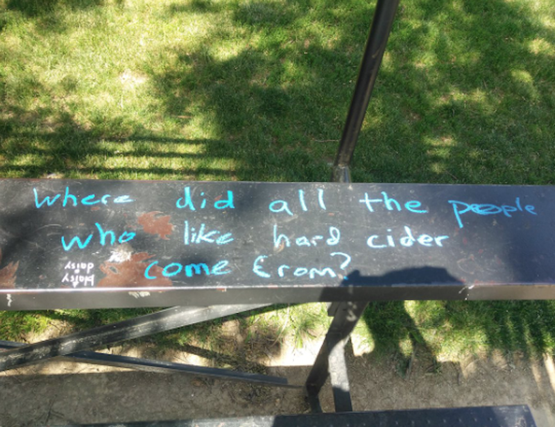
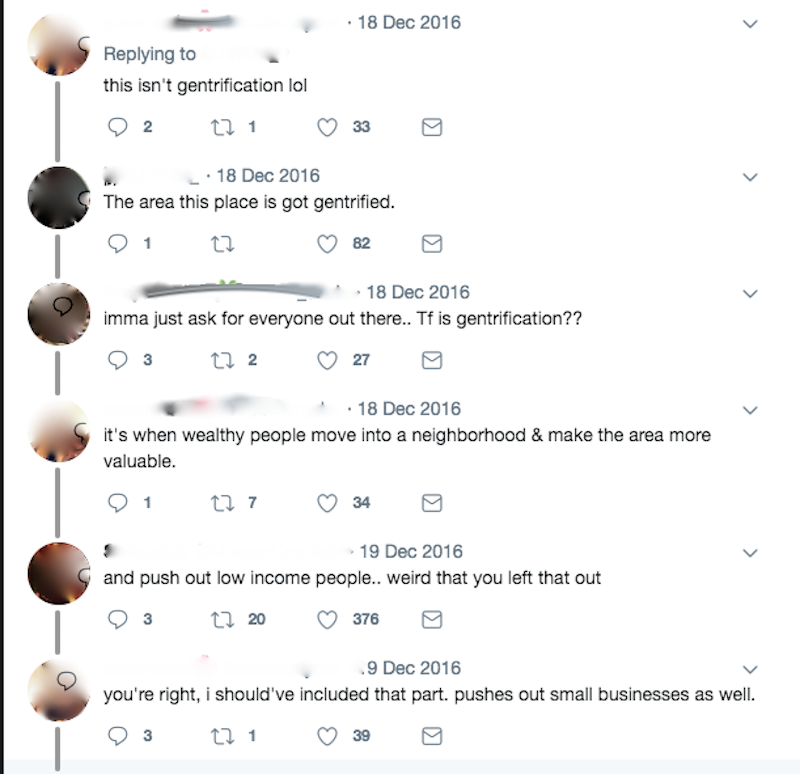
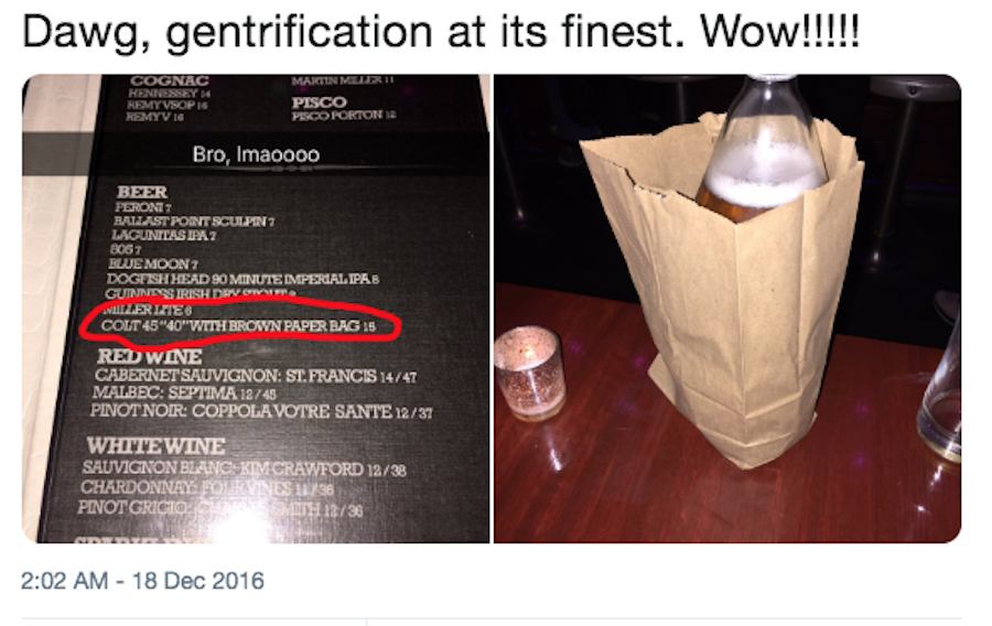
Examining the frequently occurring data in this large dataset illuminated ad-hoc anti-gentrification encounters, particularly in association with white cultural domination, appropriation, and commodification of nonwhite culture and spaces. (For other representative examples, see Figures 4, 5, and 6.) None of the graphs I generated, only one of which is contained in this webtext, however, illuminated any of the tweets made by more organized anti-gentrification groups. I knew such groups existed in the dataset, partially through my initial R frequency analyses, but also through human reading portions of the dataset spreadsheet.
Although such data representing these encounters is also present in the Tableau visualizations, none of the visualizations easily highlight these smaller encounters, which, because they occur more locally and outside of the realm of celebrity and entertainment, are not retweeted to the extent of memes like those associated with Taylor Swift. One way to locate such encounters, as the video in this section demonstrates, is by clicking and exploring data that corresponds to lower-frequency measures in the Tableau graphs. This approach was part of how I created a smaller data study related to Boyle Heights, Los Angeles, and the grassroots anti-gentrification coalition Defend Boyle Heights. "Boyle Heights" was a frequently mentioned location in the R analysis, and I identified an anti-gentrification encounter that included @DefendBoyleHts by exploring one of the less frequent data points in the Tableau chart (Figure 7, below). These experiences led me to collect additional data related to Boyle Heights, gentrification, and Defend Boyle Heights as a smaller data comparative study that also strives to situate and contextualize data in bodies and geographical spaces.
