design
In Dear Data, Giorgia Lupi and Stefanie Posavec (2016) used an analogue, hand-drawn approach to represent data. Their delightfully drawn postcards are a big part of the appeal of the project, and Lupi and Posavec, both information designers, are particularly skilled at visually presenting data in lively, engaging, and understandable ways. For students with varying degrees of interest and confidence in their visual artistry, drawing postcards and legends posed frustration, joy, or something in between.
design tools and choices
The hand-drawn element differentiated this project from the digitally designed personal infographic project assigned by Sorapure in previous sections of Writing 105M. In that project, students' facility with Microsoft Excel, Adobe Photoshop, and Adobe InDesign strongly influenced how well they did. In fact, one goal of the project was to give students experience working with these programs. The advent of drag-and-drop infographics programs (e.g., Canva, Piktochart, Infogram) somewhat leveled the playing field, but it also created a kind of homogeneity in the projects, as students used templates, icons, and other pre-made elements to represent their data. In either case, it seemed like the translation through software was ultimately a hindrance and also took time away from the actual collection of personal data at the heart of the assignment. In the Dear Data project, data collection came first, both in time and in classroom emphasis, and the representation of data followed.
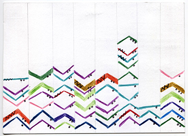
In hand-drawing their postcards and legends, students made choices that designers and artists make—for instance, choosing materials to work with. Sorapure's research funds enabled the purchase of two different kinds of thick watercolor paper, which she cut into 5"x7" blank postcards; students chose between the more textured off-white and the smooth pure white options. She also purchased an array of colored pens and pencils from which students could select and add to their own supplies. They decided on a color palette for their postcards and made decisions about the placement, size, and shape of various symbols they used to represent data. For some, this was a welcome part of the project; as Brittany Lovelace observed, "As a visual learner, the symbols, patterns, and drawings that were included in each note card spoke loudly to me and helped me view my results in a deeper way."
visualization and style
Students used the postcards in Dear Data (Lupi & Posavec, 2016) as models for their own designs, and they noted the differences between Lupi's detailed, careful approach and Posavec's looser designs and occasional cross-outs and errors on the legend side of the postcard. When they viewed each other's drafts and finished postcards, students also noted differences in the designs. The symbols, color choices, and level of detail expressed a certain individual style that further conveyed information about the student.
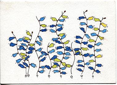
One interesting design decision made by a number of students (and not particularly represented in Lupi's or Posavec's postcards) was to use visual metaphors to help convey meaning. For instance, Jasmine Benafghoul used stars in the postcard for her second week tracking willpower; the size of the star indicates the degree of self-control she exhibited. As Jasmine explains, the visual conceit of stars for good behavior reinforces the data she is conveying. Austin Fauni used exclamation points to represent customer complaints while he was working at Starbucks; in this interview clip, Austin explains the process of deciding on a topic and a design for his postcard. Madeleine Sorapure (who did the project along with her students) used seaweed to represent her week 1 data collection, which involved smiling at strangers as she passed them on beach walks. The length of the seaweed represents the length of the walk, and each leaf represents a smile, with colors and symbols associated with each leaf representing the stranger's response to the smile. Overall students (and teacher) took advantage of multiple design strategies to convey their data.
the legend
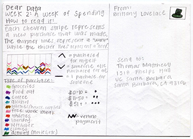
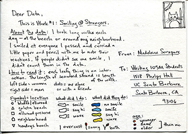
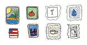
The legend side of the postcard was also an area where students expressed their individual style, visually and verbally. The primary function of the legend was to explain the symbols on the front of the postcard, so clarity was crucial. The colors, sizes, shapes, and positions of the symbols would be meaningless without the legend, and the overall topic of the postcard would also be difficult to discern. In creating the legend, then, students were providing directions on how to read their work. In a sense, as Tess Karls explains, they had created an alphabet of symbols on the front of the postcard and provided the code for their unique alphabet via the legend. Jasmine Benafghoul wrote, "In some ways it reminds me of my diary back when I was younger and wrote about my day in symbols only I knew I could interpret." The legends also had some lighthearted elements. For example, students didn't actually send the postcards so some drew their own stamps where the stamp would typically go (see below).
Overall, the hand-drawn element of the project and the act of creating artifacts that could be handled and passed around added a craft feel to the course—certainly not the norm in a multimedia course that typically focused on digital projects. Materializing data in this way is also at the heart of the Dear Data project, which Lupi and Posavec (2016) described data "as a creative material like paint or paper" (p. xi).
