When Revision Is Redesign: Key Questions for Digital Scholarship
Susan H. Delagrange
Introduction
Q: When the interface of an interactive, digital, scholarly article is designed as an integral part of the article's argument, what are the rhetorical, conceptual, and technical challenges of re-designing the project to better enact that argument?
In December 2006, I submitted “Wunderkammer, Cornell, and the Visual Canon of Arrangement” to Kairos for its upcoming special issue on Classical Rhetoric and Digital Communication. Designed in Adobe Flash 8, it was the product of work that I had been doing on the canon of arrangement, reconceiving it as a visual practice which, rather than occurring subsequent to invention, was actually its inseparable companion. I imagined arrangement as a techné that produces knowledge in the same way that 16th-century Wunderkammer did—through the process of serial juxtaposition and reflection. (For the full argument in the published version, see “Wunderkammer, Cornell, and the Visual Canon of Arrangement" in Kairos. In the discussion that follows, the title of the published article appears in quotes—"Wunderkammer." The object—a Wunderkammer—does not.)
|
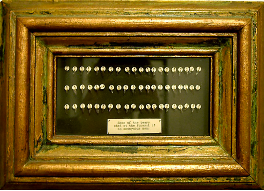
Some of the Tears Shed at the Funeral The project had evolved from a CCCC paper (with Powerpoint slides) entitled “‘Tears Shed at an Anonymous Man’s Funeral’: Digital Wunderkammern, Feminist (re)Arrangement, and Embodiment by Design” in which I had argued for the material "practice" of the Wunderkammer as an antidote to other disembodied, putatively neutral, knowledge-making structures. |
|
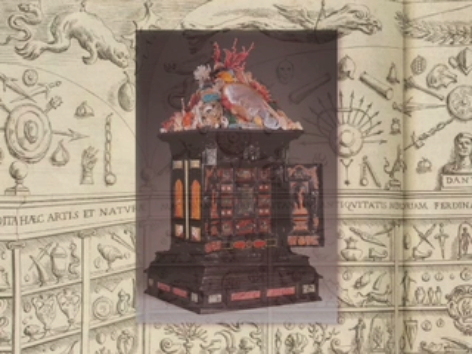
Screen shot from “Wunderkammer • My first digital version was a self-contained, minimally interactive Quicktime movie (with narration) entitled “Wunderkammer • Media Machines • Pedagogical Performance.” But at heart this was still a text about the Wunderkammer rather than a Wunderkammer itself. It included images of objects that enhanced and added complexity to the spoken text, but they remained subordinate to the meaning carried by the words. |
|
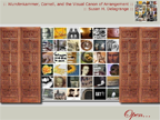
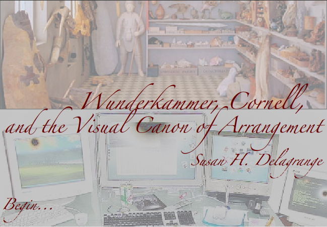
Title screen from “Wunderkammer, Cornell, I designed the 2006 iteration in Flash. Unlike the earlier Quicktime movie, this version was rich with images and animations that shifted the preponderance of evidence for my claim (that a visual canon of arrangement, exemplified in the Wunderkammer, or cabinet of curiosities, is a heuristic for invention and discovery) from the verbal to the visual. Although I still expected to fiddle with it a bit, I thought the article was ready for prime time. I was wrong. |
The news was not all bad. Editors Cheryl Ball and Beth Hewett wrote that they were "very interested in the piece," but recommended that I revise and resubmit. They suggested that I rethink my interface—physically, to provide more screen space; aesthetically, to make the design more clearly serve the argument; and conceptually, to unpack the somewhat condensed written text. Three pages of reviewers' comments expanded on these suggestions and added further observations on navigation (e.g., provide clearer directions and more signposting for viewers) and on connecting the written text more explicitly to the still and moving images.
This webtext for Inventio describes my response to Kairos' invitation for "re-envisioning," which I took as a provocation, a challenge to literally re-see and reimagine the visual and conceptual design of my argument. By highlighting some of the complexities of the design and redesign of one digital project, I hope to demonstrate the complicated relationship between seeing and design in envisioning and enacting argument, to make more visible the rhetorical and intellectual work of scholarship in digital media, and to argue by example for publishing scholarship about new media in new media.


