When Revision Is Redesign: Key Questions for Digital Scholarship
Susan H. Delagrange
Design
Q: How can digital space be redesigned so that the experience of the user more closely corresponds to the meaning-making tropes of the argument?
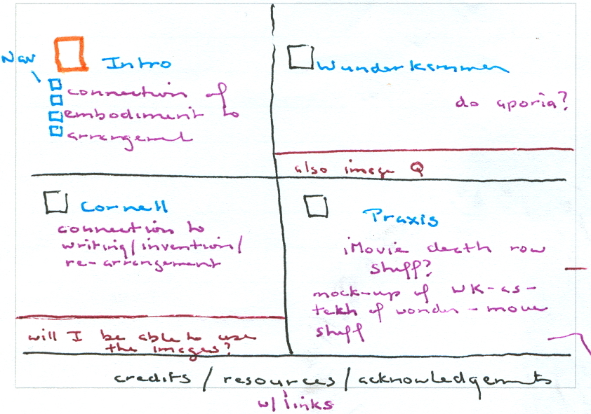
First design sketch, August 2005
As I roughed out my initial sketches for the first Flash version, I identified three elements of a Wunderkammer that were fundamental to my project:
- visual meaning should be primary, verbal meaning secondary
- images had to be active and mobile
- the action (and interpretation) had to be controlled by the viewer
My decision to design the project in Flash was a direct result of these requirements. Flash is a multimedia authoring program currently published by Adobe Systems. It allowed me to create a strong visual interface within which I could seamlessly accommodate still images, video, and text, and add animation and interactivity to those components. Flash lends itself to publication on the Web, and retains full functionality when exported as a Shockwave Flash file.
We can engage with these artifacts and the social technologies in which they are embedded through the practice of what we might call "critical wonder": a process through which digital media designers can thoughtfully and imaginatively arrange evidence and articulate links in a critical practice of embodied discovery.
The choice of Flash was not a repudiation of print media; books and journals are important knowledge-structures in their own right. Although the relationship between their matter and manner often goes unexamined, Johanna Drucker (2003) has pointed out that digital composers can learn a great deal from books if we concentrate, not on what they look like, but on how they work. My choice simply recognized that the most persuasive way to make my argument about arrangement and re-arrangement as heuristic activities was to re-create as closely as possible the experience of arrangement and re-arrangement in a digital Wunderkammer. To imitate that sense of multiperspectival investigative space, and that experience of ruminative time, the stage and timeline of Flash were the ideal solution.
Of course all design decisions have both affordances and constraints. Authoring in Flash requires significant computer memory and processor speed, and the program itself is expensive and has a steep learning curve. A high-speed Internet connection and up-to-date Adobe Flash Player are also necessary for the piece to function properly. Furthermore Flash movies are not yet fully accessible to screen readers and search engines, although Adobe is making progress on that front.
Designing scholarship in new media requires continuous oscillation among the text, the images, and the visual and conceptual framework. An idea suggests an image, an image a sentence, a sentence a motion, a motion a placement, a placement another sentence, that sentence a link, and so on. Each step in the design process is scaffolded by what has gone before, and anticipates what might come next. Despite the best intentions, however, it is easy to become so engrossed in one part of the project that it directs the development of other elements in ways that are rhetorically or aesthetically unsound. As is often the case with multimodal projects, at first I concentrated too much on the visual design without paying sufficient attention to its relationship to the argument. The best multimedia digital scholarship—like Anne Wysocki's (2002) "Bookling Monument," Adrian Miles et al.'s (2003) "Violence of Text," or Anna Munster's (2001) Wundernet—intermingle text, image, sound and motion so seamlessly in making their arguments that it is impossible to imagine it could be done in another way, or in another medium.
The 2006 version of “Wunderkammer” was not yet as visually rich as I had imagined. More problematically, the text overwhelmed the images both literally (in number of lexia) and functionally (the words controlled the appearance of the images). I needed to retrace my steps, revisit the fundamental characteristics of a visual canon of arrangement—visuality, mobility, and user-controlled experience—and redesign the interface to align with my conviction that digital arrangement could become a wonder-inducing, discovery-producing activity.
