Multimodality 2: The Multisensory Classroom Space
We can use multimodal compositions such as ASL music videos in the classroom to help our students and ourselves design for differences in bodies, senses, and modes. When we design for differences, we attend to the different channels that our students use to compose and communicate.
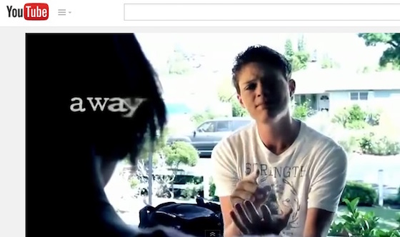
When information is expressed in multiple modes, more of us can access the meaning, regardless of our senses, our abilities, or our learnings styles. Accessible multimodal composition begins through accessible multimodal communication in the courses that we design. Sean Zdenek (2009) reminded us that “as our writing pedagogies come to depend more and more on new media,” we need to be aware of how accessible our own new media pedagogies may or may not be (p. 1). My own experiences sitting through uncaptioned or poorly transcribed videos in the classroom have been moments of exclusion in which I could not access the material as well as my hearing peers could. These memories have driven me to show how ASL music videos make meaning accessible through visual text such as the fading of the word “away” in the image from Sean Berdy’s (2012) “Enrique Iglesias’s Hero in American Sign Language [Sean Berdy]” in Figure 5 below.

Figure 5: Screenshot from Sean Berdy’s (2012) video, “Enrique Iglesias’s Hero in American Sign Language [Sean Berdy]”
When we improve the ways that each individual in our classroom can access the information being shared in our space, we open up greater opportunities for understanding and learning about each other, as Yergeau et al. (2013) reminded us. We also pay “responsible and respectful attention” to the differences our students and teachers bring to the classroom (Selfe & Howes, 2013, Over There: Disability Studies and Composition section, para. 6). Yergeau (2013) has called for participatory design that creates spaces for all bodies and rejects retrofitting and accommodation (e.g., adding a transcript or captions at the end of the design process). I affirm that we should design pedagogies that are accessible to a range of bodies and differences.
We can make our pedagogies more accessible by increasing the channels through which we communicate. If we only show uncaptioned videos in class, we are enacting “normative social systems that define, prevent, or limit access to begin with” (Yergeau, 2013, Reason: Self-Advocacy section, para. 1). Instead, we should share videos with captions—and ASL music videos—to allow students to access the video content through different channels. And we should consider further ways to make visual content accessible through descriptive audio and other modes.
Considering different ways to make content accessible supports Cynthia Lewiecki-Wilson and Brenda Jo Brueggemann’s (2008) approach to universal design for learning, which “emphasizes a range of flexible, multimodal practices and a philosophy for teaching” that designs a class for as wide a range of learners as possible (p. 6). While we cannot completely ensure that any composition or technology is universally usable—ASL music videos are not universally usable—we can appreciate, as Jay Dolmage (2008a) did, that “the push toward the universal is a push toward seeing space as in-process” (p. 180). In universal design for learning, we can actively design for as wide an audience as possible by always finding different ways to communicate through texts. We can always redesign our classrooms and our compositions to value different ways of embodying meaning—and never stop redesigning.
Dolmage (2008a) cautioned us not to assume that communicating in more modes is automatically better; instead, we need to give students the space to design in ways that work best for them. Let’s show ASL music videos as compositions that students can critique as they develop their own design strategies for communicating. Remind students that ASL music videos are not universally accessible—the visual mode does not reach those who cannot see—to reinforce the importance of always continually redesigning multimodal spaces for different audiences.
Though not fully accessible to those who cannot see, Example #2, Sean Forbes’ (2011) “Sean Forbes ‘Let’s Mambo’ Ft. Marlee Matlin,” incorporated playful and creative visual text to show how we can redesign videos to be more accessible across differences.
