Review of Virtual Martin Luther King, Jr. Project
By Nupoor Ranade, North Carolina State University

Visual Analysis
Websites, by design, are multimodal, and the Virtual Martin Luther King, Jr. (vMLK) Project has the potential for high cultural impact due to its multimodality. Gunther Kress and Theo van Leeuwen (2001) defined multimodality as "the use of several semiotic modes in the design of a semiotic product or event, together with the particular way in which these modes are combined" (p. 20). The website integrates all the elements together into a cohesive structure, which can be referred as framing (Kress & van Leeuwen, 2001). This section of the webtext review assesses the cultural expressiveness of the website through its different framing elements, which include the following strategies:
- Visual features such as
- interactivity—achieved through hyperlinks, multimedia, and navigation tools
- symmetry—achieved through repetition of page designs and replication of stylistic elements like color and background
- color—warm tones used throughout the website
- Absence of disconnection devices
- Continuities and similarities of color, navigation tools, and screens
Expressiveness
Luc Pauwels (2012) suggested a multimodal framework for analyzing websites that can be used for this review. The visual representational types and signifiers on the vMLK website can be used for analysis.
Images
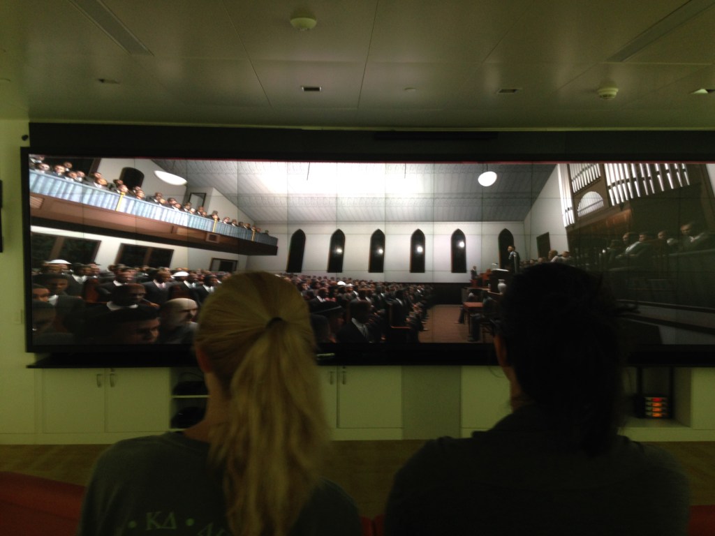
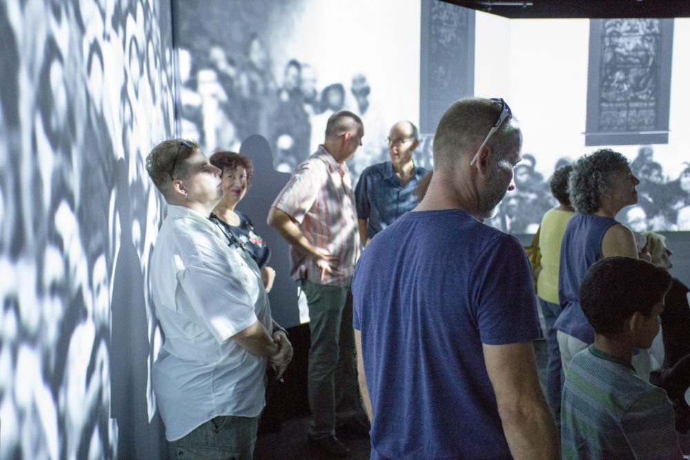
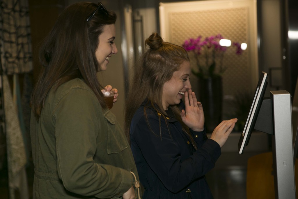
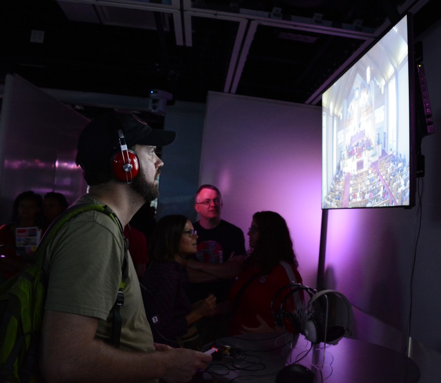
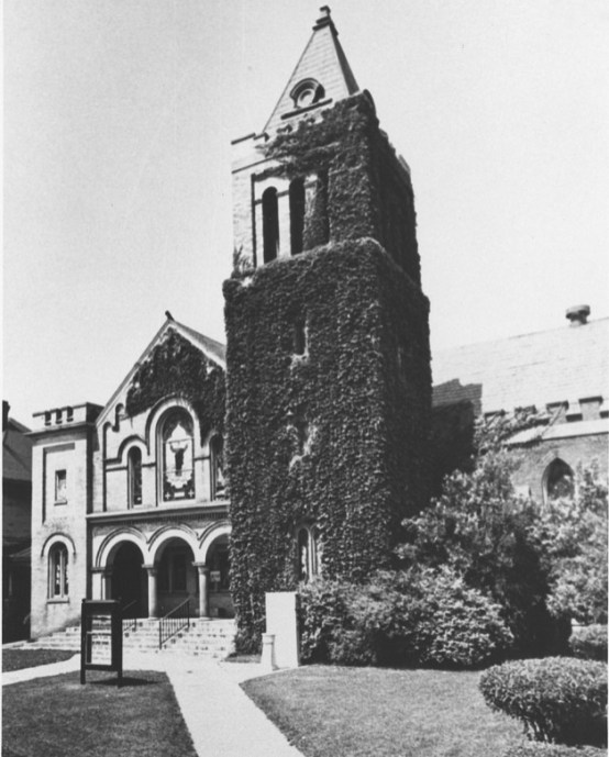 All static images on the website are taken from the live vMLK project showcase. These images show diverse audiences based on color, gender, and age. This signifies the importance of this historical event in the life of Americans. Audiences are seen to be engaged in experiencing the different formats of the project. The background image is hard to identify. It shows the picture of an entrance of a building. From the context of the project, this could be the entrance to a church, as it shows arches. Arches are a common design for church entrances. The documentary that covers the development of the different phases of the project displays this image. Images are deployed in a cluster at the bottom of most pages, following the primary content on the page that creates the actual experience. Clicking on the image allows zooming, and next and previous buttons can be used to look at all the images closely, one at a time. Videos (moving images) are used on the website to demonstrate actual experiences from the project. For example, to demonstrate the visualization lab experience, the image of the audience seated in the visualization lab is shown, and the audio of what the audiences hear in the lab is played in the background. This way the viewers of the website get a sense of how the project is laid out while also understanding the affect that it creates in the actual project environment.
Color
Color is a characteristic of multimodality. It combines freely with many other modes, including architecture, typography, product design, and document design (Kress & van Leeuwen, 2001). The color scheme used throughout the vMLK website unites the page as a whole and include cream, black, light blue, and moss green. The important content is displayed on the cream (top and center), creating a top–bottom division among the contents of the page known as a separation between the "ideal" and "real" (Kress & van Leeuwen, 2001, p. 186). Here the navigation menu and salient contextual information for most pages are placed in the ideal position in cream to grab viewers' attention. Images, videos, timelines, and other specific information about the topic is placed in the real position farther down the page. Audiences engage with the real only after complying to the ideal; in this case, audiences engage with the details only after identifying the topic. In addition to the page colors, viewers can also hover over the monochrome images at the bottom, which then turn to color. In this manner the images get contextualized to fit into the experience of the past that the website creates.
Organizational Structure
The landing page of the vMLK website lists all the different experiences that form the crux of the project. Viewers can strategically navigate from one experience to another or directly jump to sections of their interest through the menu. For example, viewers can navigate to the "Listening Experience" page (/listening) from the top menu or from the tiled menu on the landing page or from the bottom content on the Collective Experience page. This makes the project more effective for new as well as old users. Kress and van Leeuwan (2001) argued that websites should be designed nonlinearly so that the hierarchy can be decided by the reader. They affirm the circulatory trajectory that users of this website are allowed to follow. Additionally, the categorization of choices provided in the top-level menu of the website addresses Pauwels assertion that particular combinations of choices in website navigations may express more conservative or nostalgic feelings or conversely embody a more experimental, daring, or avant-garde attitude. Thus, the organization of the website elements is an effective visual cue that allows audiences to explore the webspace where they can wander and still feel grounded to the root topic.
Usability
 Although navigation makes it easy to traverse the site, there are other elements that could have caused serious usability concerns. The site's multimodal components present a great amount of risk in terms of load time and deployment tools. However, the designers have addressed those concerns efficiently. The vMLK website does not require any additional tools to run videos or view images. They can be viewed in the Google Chrome and Mozilla Firefox browsers without any trouble at all. The content is optimized, so the page loads quickly without causing delays. This ensures smooth functioning of the website. Another aspect is website search. The search feature provided on the website is helpful in locating content. The search is designed in a way to provide a list of all the pages that include the search terms with the most relevant result at the top. Searches save time and can be very useful for returning visitors.
Limitations
Expression
The only aspect from the project not present on the website is "Your Creative Protest." After experiencing the project in person, audiences are encouraged to provide feedback about their experiences of and with the vMLK project by selecting survey items or by providing answers to open-ended prompts written in the exhibit space. Those prompts include "A Creative Protest is..." and "An Idea whose time has come...." (/your-creative-protest/). The website does not provide a way to leave feedback for the vMLK team. This restricts audience expression for the virtual project that a commenting feature (or similar) could fill, but may then require moderation.
Accessibility
Although the color palette follows web accessibility principles, the multimedia components of the website do not. To make them accessible, images should be provided with alt attributes, and videos and documentaries should include transcripts.
